ZA/UM’s Disco Elysium needs little introduction. Among many, many others, the title picked up our MCV/DEVELOP award for Visual Innovation of the Year in 2020 for its standout art style. Now being released in a Final Cut form, we thought it was a good time to investigate the process behind its creation.

Was the appearance of the game core to its initial concept?
Oh, we knew immediately that we needed to make a game with a striking and unique look to accompany the writing; a look that would balance the mundane with the unfamiliar and strange. We had no video game designers on the team when we started out – only fine art painters and draftsmen, ad men, novelists, rock musicians… The aesthetic considerations were always front and centre.
What influences (within or beyond games) did you draw from?
Fine art painters for one. Think Jenny Saville, Alex Kanevsky, Sangram Majumdar, Iliya Repin, or Mikhail Vrubel. We looked beyond games to bring the strange and the different. We looked at great games with a critical eye to try and improve on the well-established design solutions. I’d like to think we’ve been successful with some of these ‘improvements’. The failed experiments brought growth in other ways.

Friendship and camaraderie are the best influences anyone could have. Most people on the team got to try on multiple hats and sometimes that led us down a path either toward absolute disaster or an unexpected minor triumph.
Can you tell us how the art was created and by whom?
The core art team at ZA/UM consists of just a few hardcore art nerds who did the heavy lifting for Disco Elysium. We’ve also been able to commission art from some really great artists. During development, it was a friendly game of tug of war between us in the art corner and the writers in theirs. There were times when we took cues from them and sometimes art would precede the writing – this allowed for great freedom in exploring our own ideas. Having now met a number of video game artists from all over the world from studios both big and small I can say that compared to standard industry practices at times we had almost unprecedented artistic freedom.
Can you put any numbers on the scale of the project?
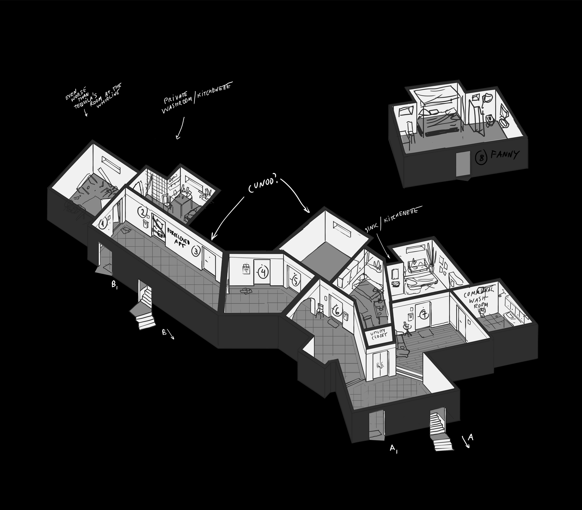
I counted 193 squares of 4K resolution environment textures in the game. Quadruple that to account for all the height maps, normal maps, and shadow maps for each painted one.
In what way did the art evolve with the project?
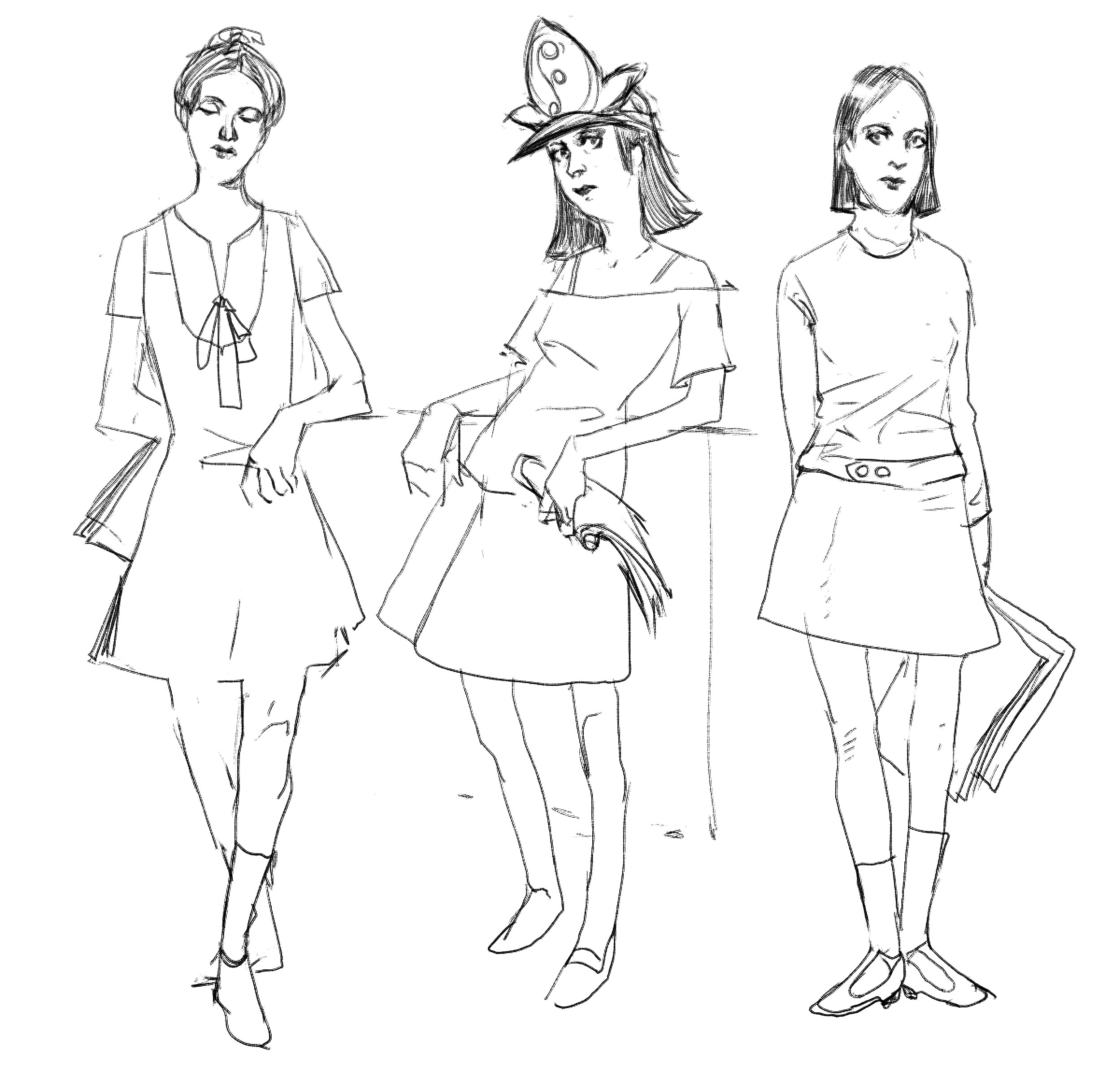
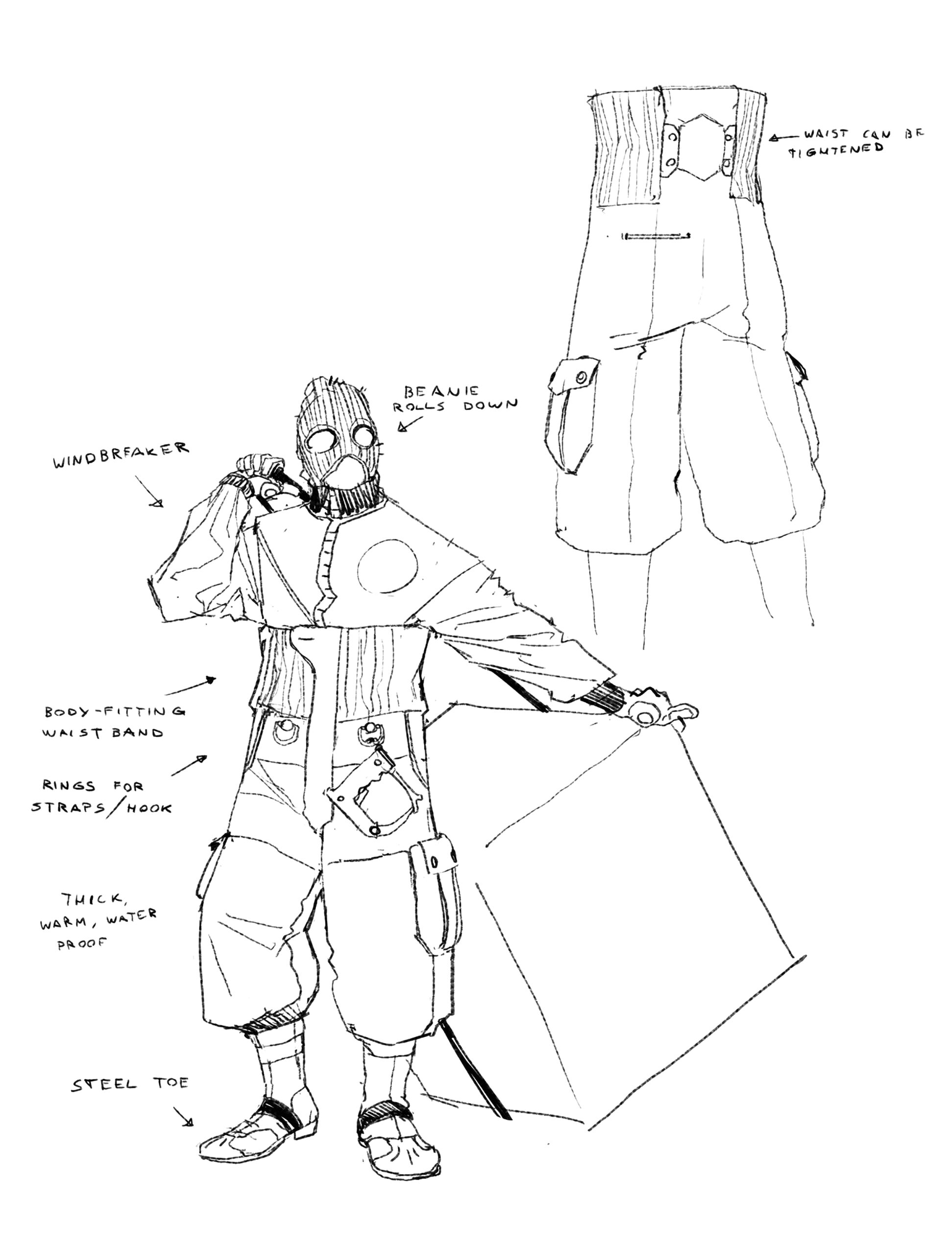
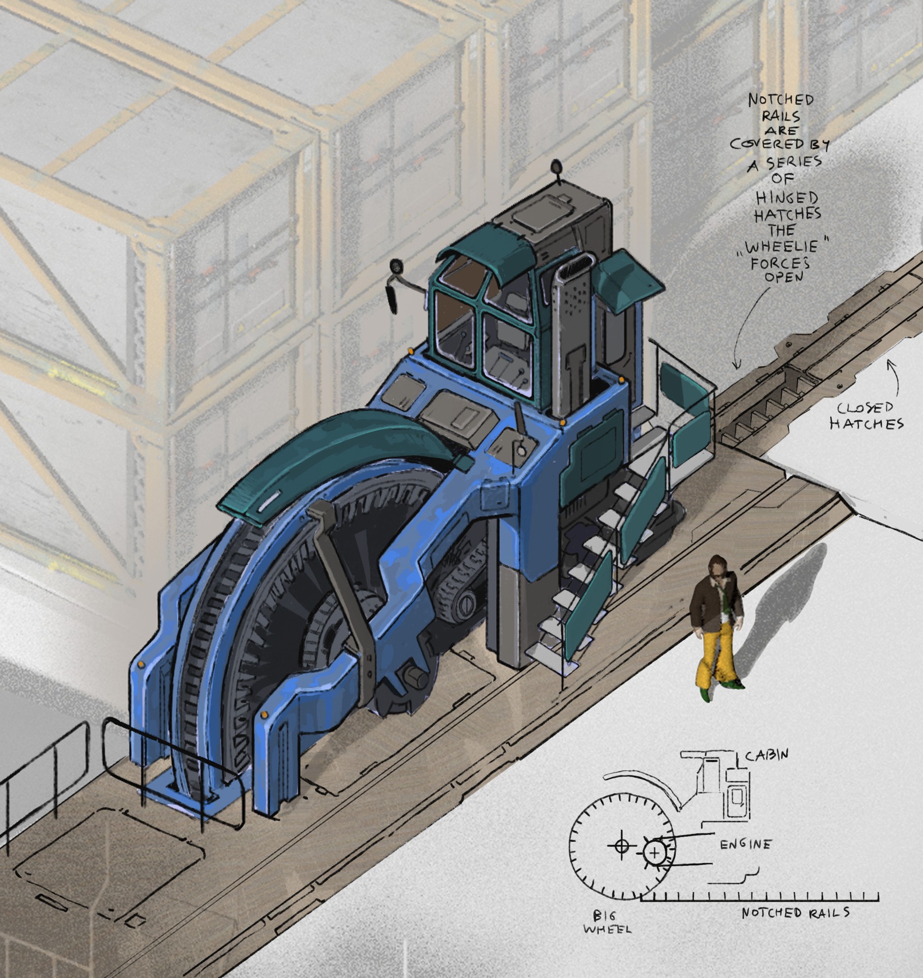
I believe that the pipeline for character creation changed at least three or four times over the years. Rendering and painting the backgrounds went through a similar number of changes. The exact level of detail to go for when painting inventory icons took a year or so of trying before we eventually settled on something. In the end, the secret ingredient holding everything together stylistically is Aleksander Rostov’s beautiful bold brushwork.


