
The National Archives of the USA is putting on a show. “Rightfully Hers: American Women and The Vote.” Out front of the show, there is a large visual display that includes an iconic photograph of the Jan 21, 2017 Women’s March on DC with some blurred out elements. Specifically blurred out is some language on the protest signs, language the Archive staff judged to be political or NSFW. You can read more about it here.
This has created a little tempest. Scholarly readings from Jörg Colberg, from John Edwin Mason, from ReadingThePictures.org, and so on have traversed Twitter with cries of Stalinist erasure and so on. “The is how democracy dies” has been repeated more than once.
Let us back up a little ways. Consider this picture, based on the same iconic photograph:


This is an imaginary poster I made, by blurring the relevant picture and putting some writing on it to advertise an imaginary show. This is clearly a promotional item, not a piece of an Archive. This is not a formal record of the event. While people might certainly complain about my graphic design skills, almost nobody would complain that I was inappropriately altering a photograph.
This is relevant because the National Archives is claiming their version of the photo as a promotional item, essentially the equivalent of my sketchy poster job here.
Here is another picture, also made by me. Imagine it, if you will, hanging in the exhibit itself, presented as a actual artifact, a object from the National Archives:
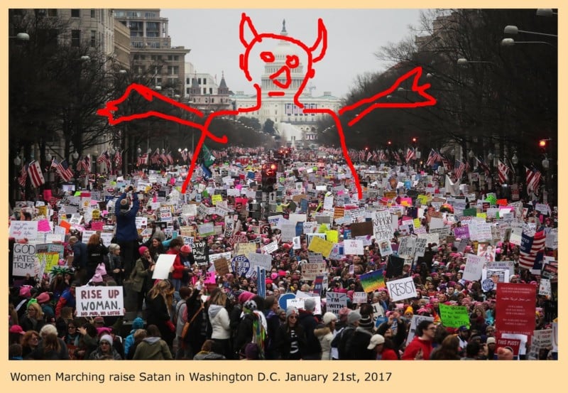

In this case, the picture is obviously a bad idea. It could be, would be, and most certainly should be vigorously attacked. The modifications alter the apparent facts (in, yes, ludicrous ways) and the picture is, we imagine, presented to us as factual.
Two pictures. One “ok” and one definitely “not ok.” The National Archives claims their altered photo falls in the “ok” region for the same reason that my fake poster does. The commentators seem to largely claim that it instead falls in the “not ok” region, without much supporting argument.
Between the extremes illustrated above there is a vast area, which includes a lot of things that are “ok” as promotional material, and a lot of things that are “not ok” as artifacts from the archive. Also, there is a good-sized grey area in which things are not so clear.
The actual altered photo is presented as a large display outside the exhibit hall, in a position where we expect to see some sort of poster, some sort of promotional material. Often but not always, though, such promotional materials include truthful, accurate, reproductions of what we can expect to see inside the exhibit. One could be forgiven for assuming that the altered photo used as a promotion is just such an accurate reproduction.
I believe the National Archives did err, here. The error, though, is not in altering an archived artifact.
They have fallen, probably by accident, into the grey area. The made a promotional picture, essentially a poster, but made two errors that compound one another. First, the alterations do not make it clear that the photograph has been altered. At first glance, it appears to be a factual and accurate photo, a “truthful” photo. Secondly, by displaying the photo in a position where it is not unusual to find unaltered photographs, they have muddled the perception.
Had they made a dramatic alteration, blurring the whole thing out as I did, the public would generally recognize it as an alteration, and hence classify it correctly as a graphic, a promotional poster. Failing that, they should have left it unaltered to avoid confusion.
The National Archives, as the supposed guardians of some sort of objective truth, of factual, concrete, things, have no business in any grey areas. They owe the public clarity. They have a duty to distinguish clearly between promotional posters and factual archival material, and they have failed, here, in that obligation.
About the author: Andrew Molitor writes software by day and takes pictures by night. The opinions expressed in this article are solely those of the author. Molitor is based in Norfolk, Virginia, and does his best to obsess over gear, specs, or sharpness. You can find more of his writing on his blog. This article was also published here.