
There is a wealth of information on the internet about composition—endless blog posts about visual rules, geometric concepts, and photos with all kinds of lines and shapes drawn over them to the prove the point. But all of this information focuses on the “what” of composition rather than the “why.” A photographer must stop and ask themselves: “why even bother following visual rules?”
Disclaimer: Should You Even Read All This?
First, a brief note on who this article is meant for. If you’re already well-versed in photography and have strong ideas about composition, then you might see my ideas and start having a debate with me in your head with me, calling me all sorts of names. And that’s okay!
What you’ll find here is a compilation (of sorts) of concepts that I’ve picked up here and there throughout the years. I’ve filtered and digested them in my brain until I’m sharing them with you now. And so, the only “authority” from which I state my ideas is my own. I do hope to shake up how you think about composition. If that sounds interesting you, please read on!

Doing Away with Abstract Geometric Concepts
Geometric ideas like the “rule” of thirds, golden ratio, and others I won’t list here, are merely arbitrary concepts. Yes, the golden ratio is a mathematical construct, and it appears sometimes in nature. But more often than not examples of the golden ratio, such as galaxies and snail shells, are not in fact the golden ratio but rather one of many other mathematical ratios.
The point is that, in the end, it’s just about numbers and shapes and bears no real meaning or emotional content.
In any case, who goes out there with a ruler and compass, measuring out ratios while composing their shots? Anyone? It’s something we can only do after the fact, and then go “ah yes, you see how the golden ratio is present in this image?” It’s similar to the English major over-analyzing literary prose: patterns can be found anywhere if you have the time to look for hours at a still image. But do these abstractions help us when we are actually shooting in the field? They don’t.
Now, there certainly are simpler and more readily “functional” concepts out there, the most famous one being the rule of thirds. Honestly, it is more a “suggestion” of thirds at best… definitely not a “rule” of any sort. Though easily applied in the moment, it’s even more arbitrary than mathematical ratios. Why thirds? Why not fourths, or fifths, or sixteenths? It’s a concept that can be used to great effect, but when used for its own sake it misses the point (more on that later).
In the end, it’s a mere shortcut that works some of the time. But why does it work when it does? First, some basic concepts…
Some Composition Basics, and I Mean Really Basic
I’m sorry… I just bashed abstract concepts and now I’m going to expound on abstract concepts. Don’t get me wrong, some abstraction and conceptual rules are unavoidable, in particular when discussing composition and framing; however, these concepts should be grounded in the frame of a camera as well as the human perception of images—more psychology than mathematics.
With that in mind, the most fundamental concept of composition (in my opinion, so if you disagree, that’s okay) is very simply put as “less is more.”


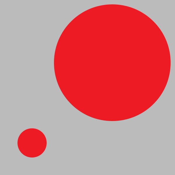
What I mean by this is that the simpler a photo is, the more impact is given to the elements that remain in the frame. The simplest image would be a single color, full frame. Bam… you know exactly what to look at because there is only one thing there. It might be boring, but the visual focus is 100% clear to the viewer.
Now add something right in the middle of the frame, perhaps a red circle, smack-dab-in-the-middle. Again, simplicity leads to a perfectly clear understanding of where the eye should rest. Almost anyone presented with the image described above would look immediately at the red circle. This is obvious.
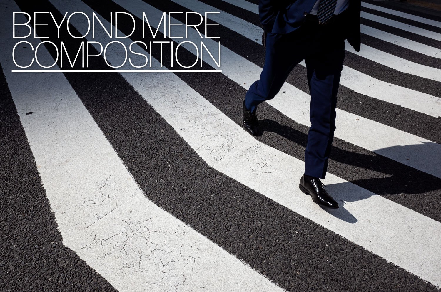
There is one other place in the frame that might have nearly as much impact as the center—the extreme edge, and especially the corners. If we place a circle half-in and half-out of the frame, anywhere along the edge, this circle will very strongly draw the eye’s attention. There is something about “leaving” the frame that is a bit eye-catching, like an itch that wants scratching. It induces tension.


I’ll explain tension in more detail later, but for now, know that one way to introduce “tension” is to put subjects away from the center and towards the edge, especially the corners. And this is why the rule of thirds often works. Those places in the frame where the third lines intersect happen to be at a “sweet spot” between the center and the corners. But there is nothing special about that spot. And it’s only one way of many to introduce tension into a photograph (but more on tension later).
So, in short, simpler images are easier to view. As the creator of the image, we can more accurately predict where the viewer will look. The viewer also has a better idea, or at least a more immediate idea, of what the photo is about. Consider a photo with a single person dead center vs a photo of a many people scattered throughout the frame.
Now, this does not mean that simpler photos are always better (take a look at the fantastic work of Alex Webb for an example of exquisite complexity in the frame). It just means, that when creating complex photos, we have to be careful in how we arrange the various subjects in the frame. To this end, simplicity is a very good starting point.
Story Comes First and Composition Should Serve the Story
Alright, so with that most basic idea out of the way, let’s actually get to the real thrust of this article: the ‘why’ of composition. Composition does not exist purely for itself (at least in most photographic genres). How the photographer composes the frame ought to always be subordinate to the narrative intention of the photographer. I say “ought” because often this is not the case. Photographs can fail when arbitrary rules are applied to the composition without any though given to their meaning.
For example, a common “rule” that is followed without question is having the horizon level. A tilted horizon is blasphemy! It goes against everything sacrosanct in photography, and spirit levels everywhere shudder at the thought of a tilted horizon. Yet, we do not ask “why?” A level horizon affords the photo stability, a static nature. On the other hand, a tilted horizon can imbue the image with dynamism. Neither is good or bad. Both concepts can be considered when telling your story (and there are other ways to imbue a photo with these characteristics).
If we want to portray a mountain as monolithic, immovable, and eternal, then perhaps it should be framed perfectly level (and probably dead in the center). Yet, if our goal is to convey the chaotic motion of a city and give the viewer a sense that the camera itself is moving, then an angled frame can achieve that. Our narrative intent is what should drive our choices when it comes to composition.

Composition with the Story in Mind
Now let’s get into some composition concepts that we can use to help support our intended narrative or feeling for the photograph.
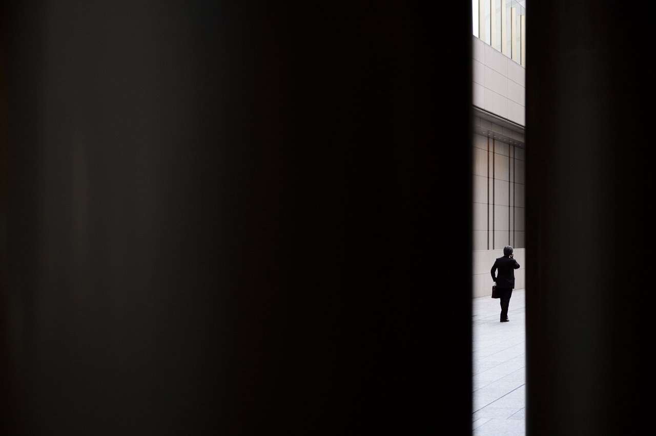
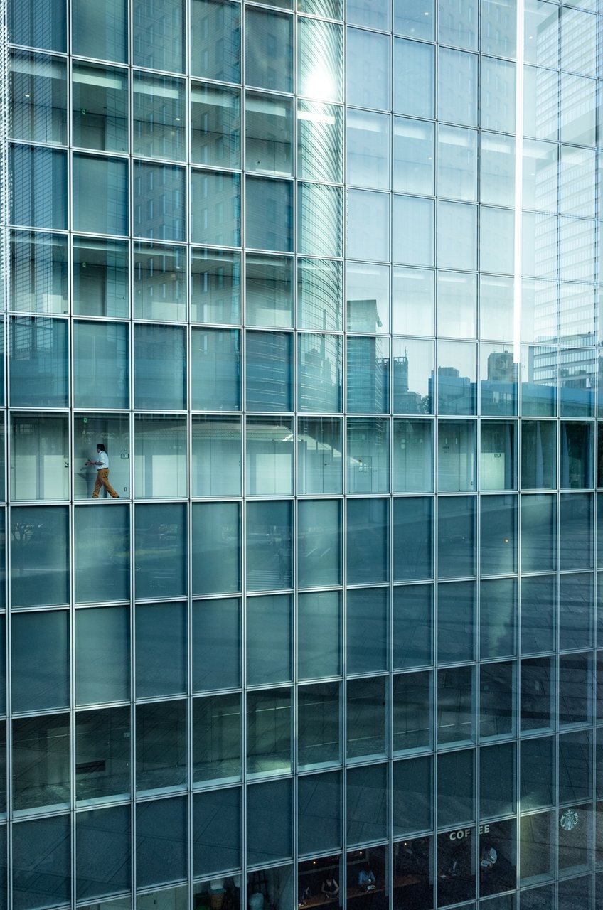
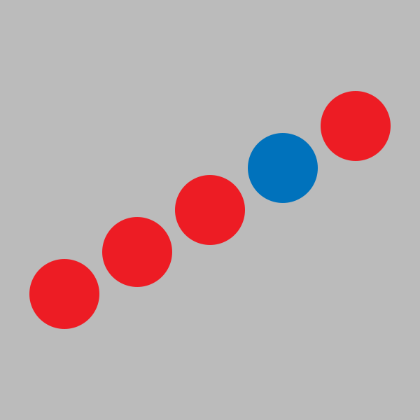
The first concept to consider is isolation. Keeping a subject separated from all other objects in the frame can bring attention to the subject, it can also underscore that the subject is strong, weak, big, small, unique, aloof, or any number of other feelings that might be pertinent to the scene at hand. Subjects can be isolated by being placed on neutral backgrounds (a visual concept called “figure to ground”) but they can also be isolated using distance in the frame, going even to the extreme of placing the subject in the very corner of the frame.
Finally, emphasizing the difference in size of objects in the frame can also evoke a sense of isolation or separation between them.


Another narrative concept, which I touched on above, is the idea that objects in the frame can be static or dynamic.
There are a number of ways that an image can appear to be either static or dynamic. Static images tend to have symmetry, straight lines going horizontally or vertically through the frame, and are generally ‘squared’ up with the frame itself. Dynamic images, that is images that convey a sense of motion, can be achieved by implementing diagonal lines, or lines that lead the eye “into” the frame (this being an illusion, since the image is, of course, a flat 2-dimensional surface on which forms are projected).
The short of it is that certain compositions evoke a sense of motion or energy (dynamic images), while others evoke a sense of stability (static images). It’s up to the photographer to decide which one is effective in a given context.

As I already mentioned above, we also have tension.
Tension can be created in a number of ways; we discussed putting the subject very close to the edge of the frame, or even in the corner. Similarly, putting objects very close together in the frame, but not allowing them to touch, can induce a feeling of tension. Similarly, subjects occupying small empty spaces in the frame evoke a sense of tension (frames within frames). Also, objects apparently moving away or towards each other have this effect.
Finally, once colors come in to play, tension can also be achieved by contrasting colors in a variety of ways. Notice how this concept is related to, or built upon, the previous two (isolation and stasis/dynamism). Once again, how the concept is used is very context-dependent and it can evoke different emotions in the viewer.

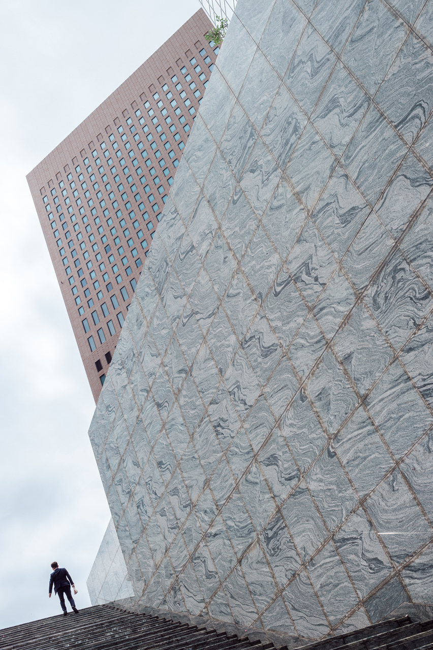
Finally, there is leading geometry. This goes a bit beyond the usual example of leading lines (typically train tracks or something receding into the distance).
Leading geometry is the concept that all of the objects in the image guide the eye in some way. We tend to look at something first, then another thing, then another. Sometimes we ignore certain parts of the frame if they are not interesting. The arrangement of forms in the image, whether it’s mostly geometric or more contextual, guides the eye. It could be the direction someone is walking, or where they are looking, or a brightly colored object that stands out against a monotone background.
Leading geometry, like the previous concept of tension is not easily distilled into a simple idea. It’s something that arises from combining all of the concepts I’ve mentioned above.
And that should be our goal: to combine all of these ideas into an interrelated tapestry of forms and shapes that lead the eye while implicitly conveying feelings and perceptions to the viewer. Of course, not every shot requires all of these things. Some photos can simply be… simple. But some of the best photography, in particular street photography, seamlessly weaves these concepts together. And by doing so, it evokes a particular perception in the viewer’s mind.
How to Compose in the Moment
Let’s get into some specific decisions you can make while actually out shooting, starting with a very basic decision as an example: portrait or landscape (orientation)?
It boils down to a matter of context. You should ask yourself this question constantly: “where is the context?” It sounds a bit rudimentary, but I often see my students struggling with this very decision during my workshops. Often, they choose the (in my opinion) wrong orientation because they are focusing too much on the shape of the subject and not the context surrounding it.
For example, a person is often photographed in portrait orientation because people are long vertically. Conversely, cityscapes are nearly always in horizontal orientation because that’s how we generally see the world through our own eyes. But in many cases, the context or juxtaposition for a scene lies in an unexpected direction. We should then make a conscious effort to identify the subject and then choose our framing accordingly.

This idea of context leads back to the concepts mentioned earlier, which I generally sum up as “leading geometry.” All of these previously mentioned concepts facilitate the viewer’s journey through the frame, creating a hierarchy of forms and subjects that can be absorbed in sequence. To decide how to frame, we must pay close attention to the context, the surroundings, and then decide how to implement isolation, tension, stasis, dynamism, etc. in order to allow the viewer to explore and absorb the subject in its context in a fluid way.
In my view, this is what makes visually stimulating photography.
In the end, all of these ideas cannot decide for you, the photographer, which elements in the frame should be primary, secondary, etc. You must consider leading geometry in your photography, bearing in mind that the ideas should not serve themselves. Rather, they should serve the subjects and context of the scene you wish to capture.
And here’s the kicker: because everyone’s brain is already innately accustomed to interpreting these visual concepts, it is already in tune with them. So, it’s a matter of training yourself to be conscious of them while looking through the viewfinder. The process ends up being much more intuitive and faster than thinking about geometric ratios and other such abstractions. With enough practice, noticing these visual cues becomes second nature.
Inspiration and Further ‘Reading’
It is certainly not easy to infuse photographs with compositions that actually compliment the intended themes of the image. The problem is that photographs can be ambiguous. This is a given, since the images are still and so they lack a temporal context. Of course, when you are creating the images this is less of a problem. You, as the photographer, know the temporal context and can compose with this in mind. The obstacle of ambiguity occurs when analyzing other people’s images.
I find it difficult to always accurately dissect what another photographer intended with their composition. I might find certain patterns that stimulate my perception, but those might not be exactly what the creator had in mind. And so I turn to movies as my inspiration. Feature films contain a narrative that lends context to the moving pictures on the screen. This eliminates a lot of the ambiguity and allows for a more accurate and definite interpretation.
Therefore, as “further reading,” I highly recommend carefully analyzing the next movie you watch. To start you off, I recommend a classic of film noir: The Third Man. This film uses a number of compositional techniques (oblique angles, figure-to-ground, visual tension, leading lines, etc.) to not only compliment the story, but visually imprint the narrative in the viewer’s perception. It’s worth a watch on its own merits, but makes for an invaluable source of visual inspiration.
About the author: Lukasz Palka is a freelancing Tokyo photographer who is the co-founder of EYExplore photography workshops. You can find more of his work on his website or by following him on Instagram, YouTube and Facebook. This article was also published here.


